

Mobile First Strategy: Why Start Small
Building for phones first makes everything simpler. Learn why constraints actually solve design problems instead of creating them.
Read Article
Real device testing beats emulation every time. Here's our practical checklist for testing responsiveness without expensive lab setups, plus tools that actually work for remote teams.
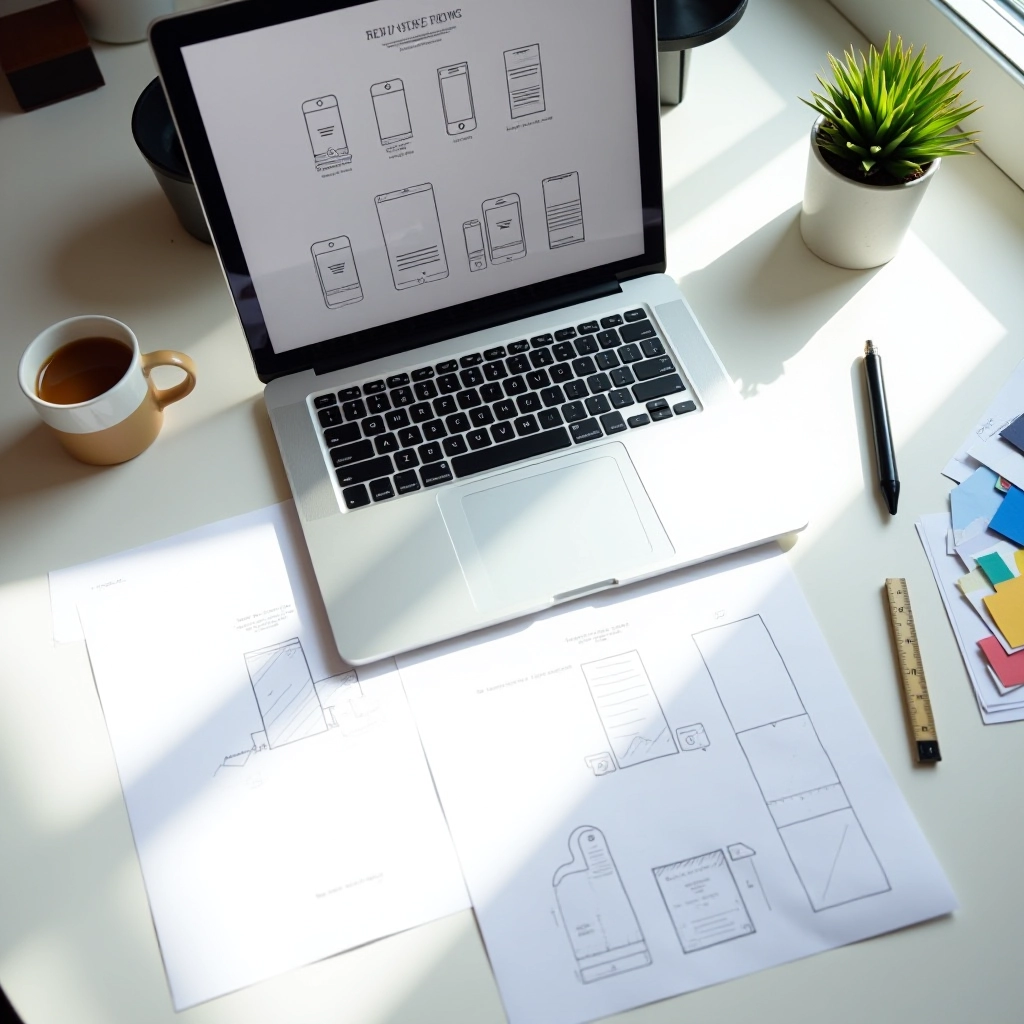
Editorial Team
Written by the GridFlow Design editorial team, focused on practical, easy-to-follow guidance for responsive and mobile-first design.
You've built a responsive site. The browser tools look great at every breakpoint. So why does it feel off when someone pulls it up on their phone?
Browser emulation is convenient — but it's not real. Real devices have different processors, screen densities, touch behaviors, and network speeds. We're not saying you need to buy every phone on the market. We're saying you need a smarter testing strategy. One that catches actual problems without breaking the bank.
This guide walks through the tools, techniques, and shortcuts we use when testing responsive designs for clients across Canada. Some cost money. Most don't. All of them work.

Not all testing is created equal. We use what we call a "three-tier approach" — and it's saved us from shipping broken designs more times than we can count.
Start here. Chrome, Firefox, and Safari all have excellent responsive design modes. You'll catch 60-70% of issues without leaving your desk. Good for quick iteration during development.
BrowserStack and Sauce Labs let you test on actual devices remotely. You control a real iPhone or Android phone from your browser. Takes 10-15 minutes per device. Catches the real problems emulation misses.
Test on YOUR devices. iPhone, Android, tablet — whatever you personally use. You'll catch interaction quirks and performance issues that services can't simulate.
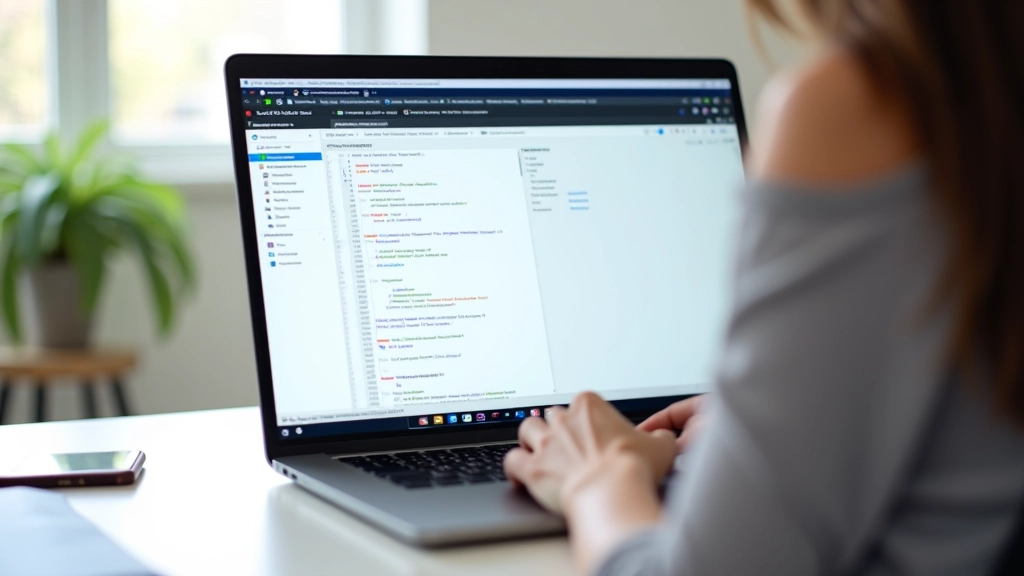

Here's what we actually test on every device. This takes about 20 minutes once you get the flow down. We've split it into categories so you don't miss anything.
Deepen your understanding of responsive design with these related guides.
Building for phones first makes everything simpler. Learn why constraints actually solve design problems instead of creating them.
Read Article
Grid systems aren't about rigid columns. We break down how to build flexible grids that actually adapt to content and viewport.
Read Article
Stop copying standard breakpoints. We show you how to find breakpoints that fit your actual content and users.
Read ArticleThe best testing strategy is one you'll actually use. Don't aim for perfection across 47 devices. Aim for a repeatable process that catches real problems.
Here's what works for us: We start with DevTools during development. Quick, iterative feedback. Then before launch, we spend 30 minutes on BrowserStack testing 4-5 key device combinations — iPhone 13 and 14, one Android flagship, iPad. We test on our personal phones too.
That's it. Not fancy. Not exhaustive. But it's caught every major responsive design bug we've shipped in the last 2 years.
Pro tip: Test on the slowest connection speed you can tolerate. Go to DevTools Network Slow 4G. If it works there, it'll work everywhere. Performance problems show up fast.


If you're working with a distributed team or clients across different regions, remote testing services become even more valuable. You're not trying to coordinate shipping devices around. Everyone accesses the same cloud-based testing platform.
BrowserStack's team features let you share test sessions. Developer finds a bug, records it, shares the link with the designer. Designer sees exactly what the developer sees on that device. No guessing. No "it works on my phone" arguments.
The subscription costs money, sure. But it's way cheaper than buying test devices for everyone on your team. And it's faster. You're testing in real-time instead of waiting for someone to physically test something.
For teams on tight budgets, don't skip device testing entirely. Use free DevTools for most work, then budget for 1-2 weeks per month on a paid service for critical launches. That balance works.
You don't need a lab full of devices. You need a system. Start with what you have — your computer and your phone. Test in DevTools, then test on real devices. That's 80% of the work right there.
Add a remote testing service when you're ready. Build the habit of testing across devices into your workflow. It doesn't take long. Twenty minutes per site, tops. And it'll save you from shipping broken designs that frustrate your users.
Responsive design isn't just about breakpoints and media queries. It's about making sure your site actually works for the people using it. Real device testing is how you know it does.
Individual learning outcomes vary from person to person. This guide is informational and educational in nature. The techniques and tools described reflect our experience and industry best practices as of June 2026. Technology and tools evolve, so we recommend checking official documentation for current features and pricing. Your specific project needs may require different approaches than those described here.