

Mobile First Strategy: Why Start Small
Building for phones first makes everything simpler. Learn why constraints actually lead to better design decisions and faster development.

Grid systems aren't about rigid columns. We break down how to build flexible grids that adapt gracefully at every screen size without needing dozens of breakpoints.

Editorial Team
Written by the GridFlow Design editorial team, focused on practical, easy-to-follow guidance for responsive and mobile-first design.
A good grid system isn't rigid. It's responsive. It's about creating proportional relationships between columns that scale beautifully from a 320px phone all the way up to a 2560px desktop monitor. You'll find most sites still use fixed-width grids or hardcoded breakpoints — and honestly, that's where things break.
The problem? Fixed grids force you into predetermined sizes. You get 12 columns at 1200px, but what happens at 1024px? Or 768px? You end up writing media queries for every device ever made. Instead, we're going to show you how to build grids that adjust themselves without all that extra code.
We use flexbox for our grid systems because it's flexible by nature. It doesn't force you into a 12-column prison. Instead, you define how items should behave — how they grow, shrink, and wrap. A column at 50% width on desktop automatically becomes 100% on mobile if you've set it up right.
The key is using flex properties thoughtfully. Set flex: 1 1 45% and your columns will be 45% wide, wrap when needed, and fill available space proportionally. No media query needed just to adjust column width.

Quick tip: Use flex-basis instead of width. It respects gaps and doesn't cause overflow. flex: 1 1 45% means the item grows, shrinks, and has a base width of 45%.
Let's build something concrete. You've got a container with items that should be roughly equal width on desktop, stack on mobile. No magic needed.
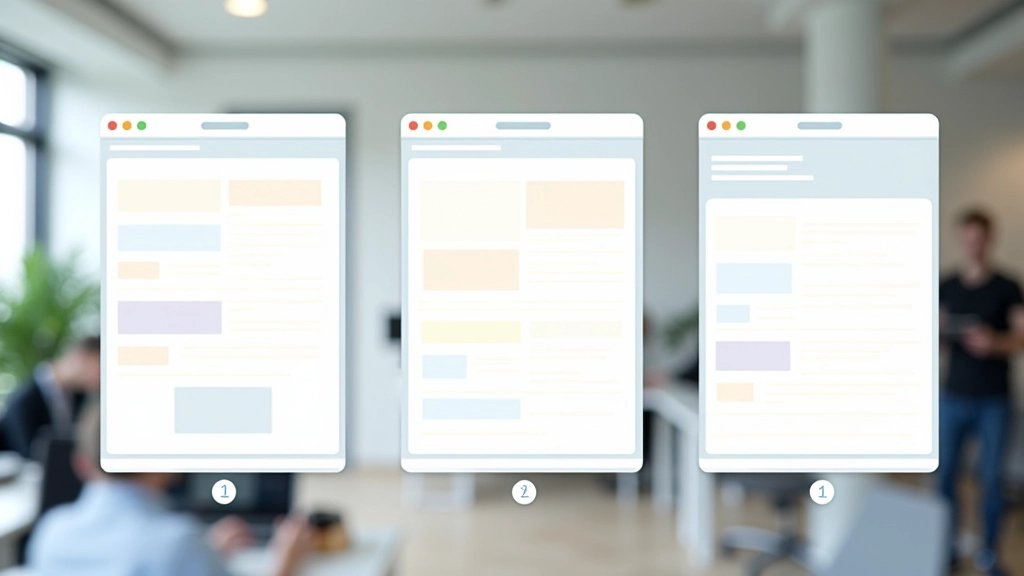
Start with mobile (100% width, stacked). Then at 640px, let items be 50% wide (two columns). At 1024px, items become 33% (three columns). You're not adding breakpoints for every device — you're defining breakpoints where your design actually needs to change.
The container has display: flex, flex-wrap: wrap, and gap: 2rem. Each item has flex: 1 1 calc(100% - 2rem) on mobile, flex: 1 1 calc(50% - 1rem) at 640px, and flex: 1 1 calc(33.333% - 1.33rem) at 1024px. The calc() accounts for gaps so items don't overflow.
Here's where most developers stumble. You set flex: 1 1 50% and suddenly at 640px you've got overflow because you didn't account for the gap. That 2rem gap between items takes up space, so two 50% items plus a gap = more than 100% width.
Use calc() to subtract gap space from your flex-basis. If you've got a 2rem gap and want two columns, each item should be calc(50% - 1rem) — that's 50% of the container minus half the gap. This ensures items fit perfectly without overflow.
It sounds math-heavy, but it's actually simple once you write it once. And it scales. Add a third column? calc(33.333% - 1.33rem). Four columns? calc(25% - 1.5rem). The pattern is consistent.
Most frameworks get this wrong, which is why their grids feel fragile at certain viewport sizes. You've got this — use calc().

Explore more guides in responsive design and mobile-first principles.
Building for phones first makes everything simpler. Learn why constraints actually lead to better design decisions and faster development.

Stop copying standard breakpoints. We show you how to find breakpoints that fit your actual design, not arbitrary device sizes.

Real device testing beats emulation every time. Here's our practical checklist for testing layouts where people actually use them.
Flexible grid systems aren't complicated once you understand the core principles. Use flexbox with flex-basis percentages, account for gaps with calc(), and define breakpoints where your design actually changes. You don't need a framework or a dozen media queries. You need proportional thinking and simple math.
Start building your grids this way on your next project. You'll write less code, maintain it more easily, and your layouts will be more resilient to unexpected viewport sizes. That's the whole point — grids that actually flex.
Note: Individual learning outcomes vary from person to person. These techniques work across modern browsers, but browser support and CSS specifications evolve. Always test your implementations across your target devices and browsers. This guide reflects best practices as of 2026.