

GridFlow Design Logo GridFlow Design Contact Us
Contact Us
Modern web design workspace with responsive layouts displayed on multiple devices and monitors

Responsive Layout & Mobile First Design

Master adaptive grid systems built for Toronto's modern web design landscape

Featured Articles & Guides

Learn the fundamentals of responsive design, from breakpoints to flexible layouts

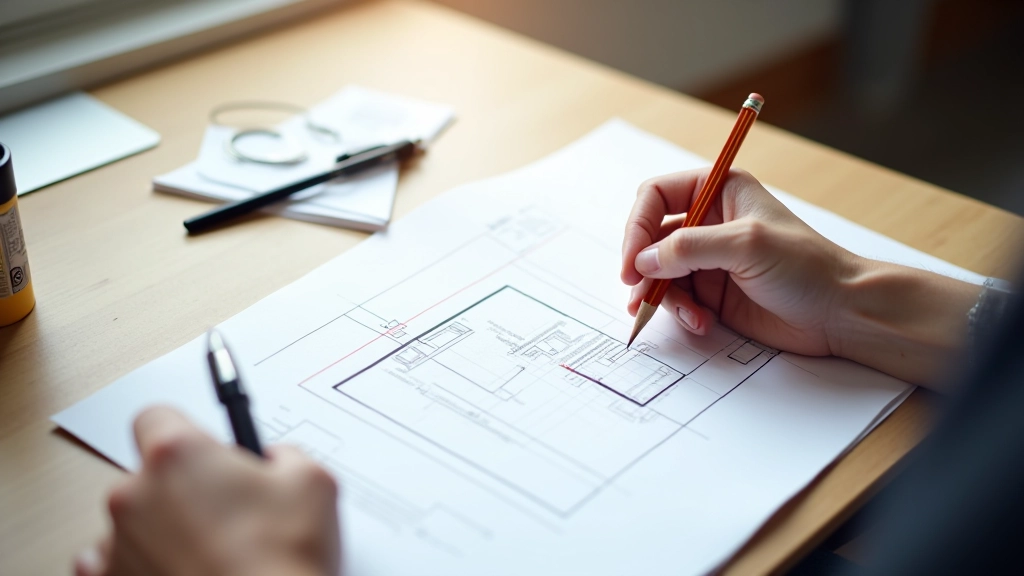
Designer sketching mobile-first wireframes on paper with grid rulers and measurement tools

Mobile First Strategy: Why Start Small

Building for phones first makes everything simpler. Learn why constraints actually improve your design decisions and how to structure your workflow around this approach.

7 min Beginner July 2026
Read More

Computer screen showing CSS flexbox grid system with color-coded layout columns and breakpoint indicators

Understanding Flexible Grid Systems

Grid systems aren't about rigid columns. We break down how to build flexible grids that adapt gracefully at every screen size without needing dozens of breakpoints.

10 min Intermediate July 2026
Read More
Tablet and smartphone side by side showing the same responsive website layout adapting smoothly across different screen sizes

Breakpoints That Actually Make Sense

Stop copying standard breakpoints. We show you how to find breakpoints that fit your actual design, not the other way around. Includes real examples from Toronto-based projects.

9 min Intermediate June 2026
Read More
Web designer testing responsive website on multiple devices while taking notes and reviewing performance metrics

Testing Responsive Design Across Devices

Real device testing beats emulation every time. Here's our practical checklist for testing responsiveness without expensive lab setups, plus tools that actually work for remote teams.

8 min Beginner June 2026
Read More
"
Responsive design isn't about making everything work on every screen. It's about understanding your content, knowing your users, and building layouts that serve both. We've learned that the best designs come from designing for the smallest screen first — not because it's trendy, but because it forces you to ask the right questions about what actually matters.

Editorial Team, GridFlow Design

Common Questions About Responsive Design

Practical answers for designers working on real projects

What's the difference between responsive and adaptive design?

Responsive design uses flexible layouts that flow and adapt continuously. Adaptive design detects device characteristics and serves pre-built layouts for specific screen sizes. Most modern projects use responsive techniques because they're more flexible and require less maintenance. You're designing with percentages and flexible units rather than fixed pixels for specific devices.

How many breakpoints do I actually need?

There's no magic number. Start with two: one for mobile and one for desktop. Then test your design on actual devices and tablets. Add breakpoints only where your design breaks down. We've found that most projects do fine with 3-4 thoughtfully chosen breakpoints rather than trying to support every possible screen width.

Should I use media queries or container queries?

Media queries are the current standard and have excellent browser support. Container queries are newer and allow components to adapt based on their container size rather than viewport width. They're becoming more practical for complex component systems, but media queries are still your foundation. Many projects use both for different parts of the design.

How do I handle images responsively without loading unnecessary files?

Use the srcset attribute and the picture element to serve appropriately sized images for different devices. This prevents loading a desktop-sized image on mobile while still serving high-quality images where needed. You can also use modern image formats like WebP with fallbacks. CSS techniques like object-fit and object-position help images scale smoothly without distortion.