
Our Work
Practical courses and guides designed to help Toronto designers and developers master responsive systems

Mobile-First Foundations
A 12-week beginner-friendly programme built around weekly practical sessions. Learn the strategic thinking and hands-on techniques for designing mobile-first, then scaling up to larger screens with confidence.
Adaptive Grid Systems
Deep dive into CSS Grid and Flexbox with real-world layout patterns. This course covers auto-fit techniques, grid-template-areas, and component-based systems you'll use in production work.

Testing Responsive Design Across Devices
A practical walkthrough covering both browser DevTools and real device testing. Includes checklists for common breakpoints, touch interactions, and performance validation on actual phones and tablets.
Breakpoints That Actually Make Sense
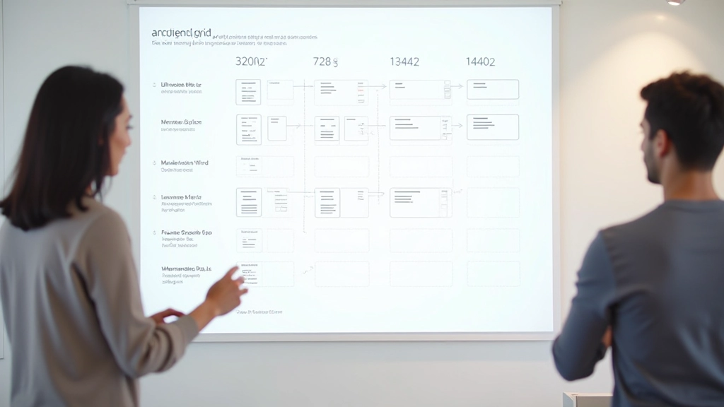
Stop guessing about screen sizes. This guide explains how to choose breakpoints based on your content and audience, not arbitrary device widths. Includes decision frameworks for mobile, tablet, and desktop layouts.
Ready to dive in?
Get in touch with us to learn more about our courses, ask questions, or discuss how we can help your team master responsive design.
Contact Us